04. fall out boy + relient k
memory
Somewhere in my belongings, I still have several CDs full of hand selected Fall Out Boy and Relient K songs that my closest friend burned for me. I've been telling her that I've been looking for it but can't find it.
She's pretty disappointed about that.
parameters
I was that really annoying kid who used to shine light onto the backs of CDs and reflect the light into other's faces (and sometimes into houses). I know, very annoying. But, I was fascinated by reflective qualities of the CD.
For this experiment, I worked in Dimensions exploring the reflective quality of the preset metal materials.
reflection
I'm relatively inexperienced with Dimension (though I guess I know enough to help teach sophomores how to use it!), but have always had a good time playing around with the materials and camera capabilities. I have also been pretty interested in Dimension as an actual art form (instead of just mockup/rendering/showcase/etc.) of image making.
Experiment A: I was trying to play around with the camera angle to see at what points letter forms are still readable, even if distorted (such as playing with the depth). The reflective properities of the materials allso lend for interesting light surfacing and shades at ridges.
Experiment C + D: Visually distorting the reflection of type is very interesting to me. Perhaps using real CDs to reflect type and capture the reflected type could be interesting? Maybe with spoons?
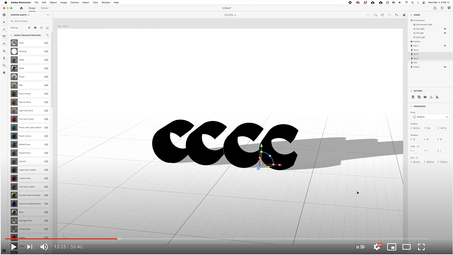
Experiment F: I think that what's really interesting is the idea of creating (or at least making models) of new typefaces by playing with camera angles. Perhaps utilizing the camera and long-depth monoweight forms to create hi-contrast "sketches" of what type could look like is appealing.

experiment A. → Playing with the reflectiveness of light along a really long-depth "F" and the angle of the camera to "distort" the readability.

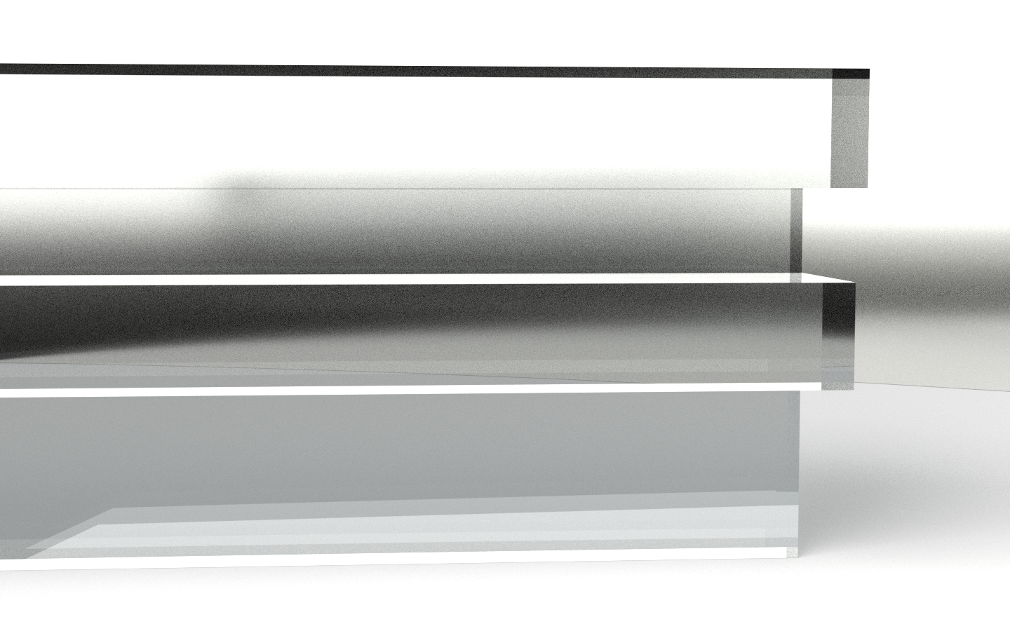
experiment B. → Translucence and reflectiveness of interior and exterior of the letterform allow for unpredictive shapes to form within the letter.

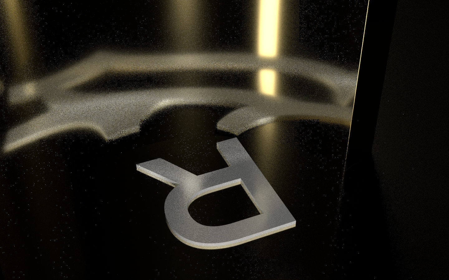
experiment C. → Placing a letterform on the ground with a highly reflective half-pipe to distort the letterform.

experiment D. → Changing out the letterform from experiment C for a more "simple" one.

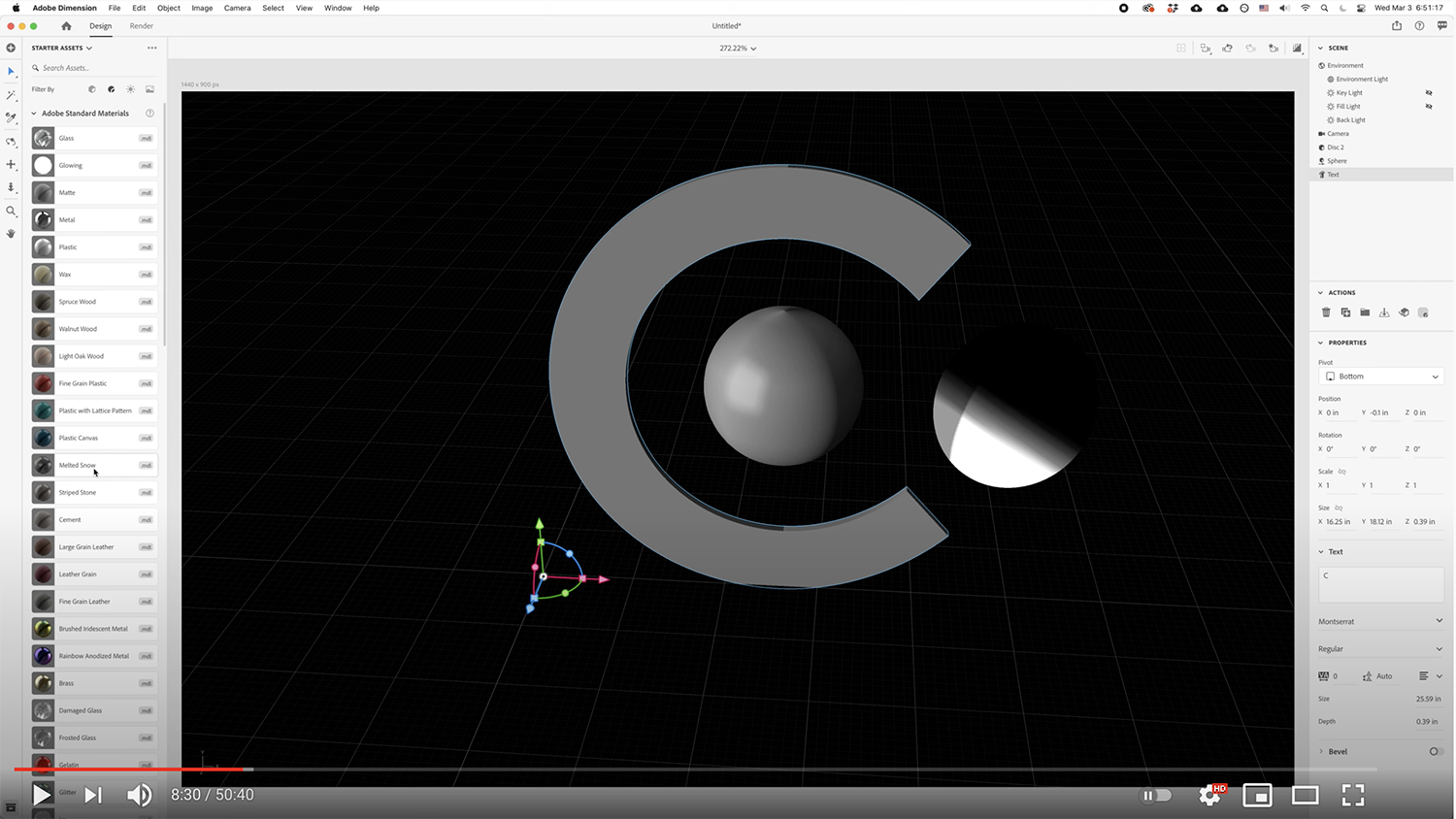
experiment E. → Taking a look at readiability of type as shape vs. letterform. Still working around to play with the capabilities of Dimension.
→
view video at timestamp

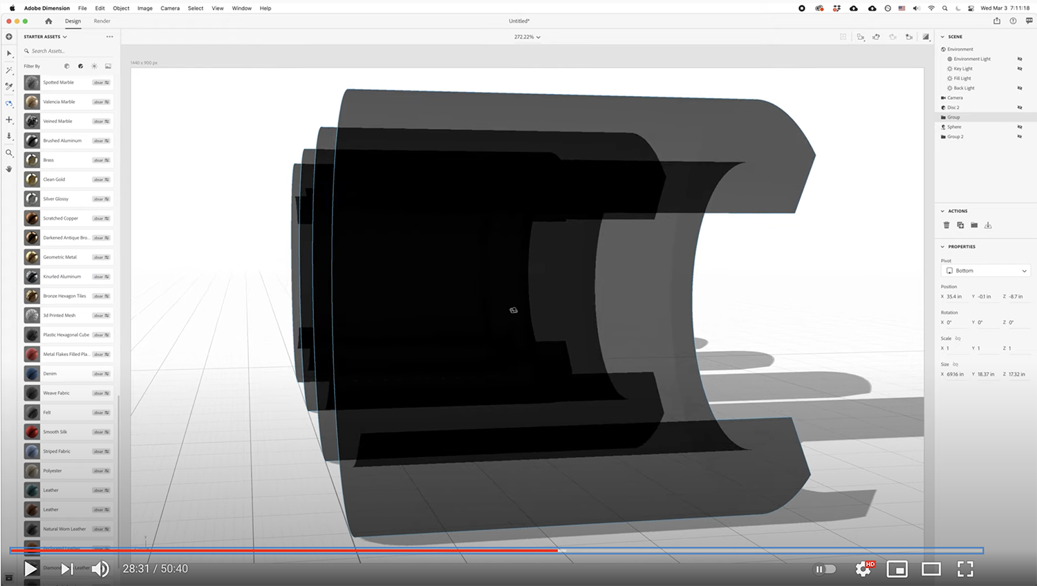
experiment F. → Utilizing angle of camera on long-depth, monoweight "c"s to create perceived hi-contrast type.
→
view video at timestamp

experiment G. → Transparency of "c"s to play with layered readability.
→
view video at timestamp
